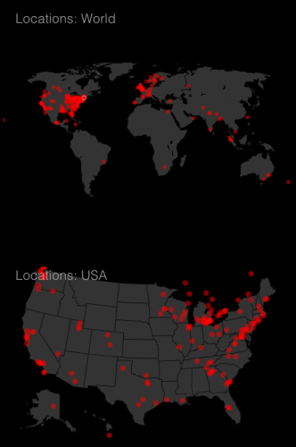
A friend recently built me a custom realtime traffic dashboard for TinyNibbles, complete with an awesome global traffic map. This is a quick screencap from tonight’s traffic, showing me where you are all coming from. I was pretty surprised at some of the hotspots – and grateful to those who visit despite cultural or legal risk. I love my readers – you – so much, thank you for visiting!
FYI – I’ll tweet occasional maps and data about this site from the @tinynibbles Twitter account, where you can also get a tweet of every single post within a minute of posting.


The dot to the east of Australia that appears to be sitting in the middle of the ocean is (possibly) me! Violet Blue, I love your blog :) Thanks for all the great content!
I find data visualizations terribly interesting. They, and I’m not quite sure how, bring the humanity back into the internet. It puts a face, so to say, on the people visiting.
I think it would be the coolest thing ever to be able to see the internal metrics of a site like Google, ya know? To be able to take potentially terabytes of traffic, usage, and location data and bring it into a photo or a series of photos. With added context, those photos can speak volumes about the people visiting.
I love it when websites do the same sort of tracking and then publish the data, or at least the photos.
So thank you, Violet, and I hope you show us many more pretty data pictures in the future,
Wow, there are more readers in the Atlanta area than just me? Neat!
I’m on holiday and accessing the site on my mobile and noticed there is a hit in the city where I am, do wonder if it it was me or if many people in Portugal access through site?
You’re missing half of Michigan! I am a red dot, floating in the blackness of nothing. D:
Haha! I’m the red dot in South America!!!! Along with others, of course, but that is exactly over me!!! :):):)