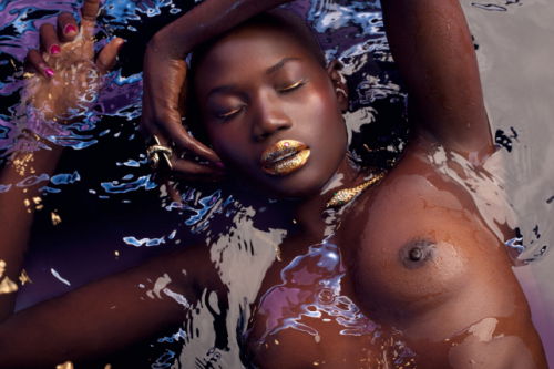
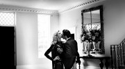
A nice detour in your travels tonight might be provided by visiting the “Editorial” galleries on Australian fashion photographer Henryk Lobaczewski’s website. It’s in that annoying Flash design so many international photographers use, and is typically unintuitive, but there are a few images that have really stuck with me (like this one), making the poking around well worth it. Like the image above. There is also an “Editoral: Men” gallery with some pretty sexy guys (though sadly there are no nudes in the male gallery). Found via Unscathed Corpse, gladly still unscathed after the recent Google Blogspot sex blog purge.
2 Comments - COMMENTARY is DESIRED
Post Comment
You must be logged in to post a comment.

Hi Violet Blue. Do you have an exemple of a website design (for a photographer) that you like? thanks
yech, browser-resizing flash, we hates it!